Ardentflow
ArdentFlow is a Houston-based AI company helping small and mid-size businesses run smarter with agentic AI systems that work 24/7.
Branding
Web Developement
SEO & AEO
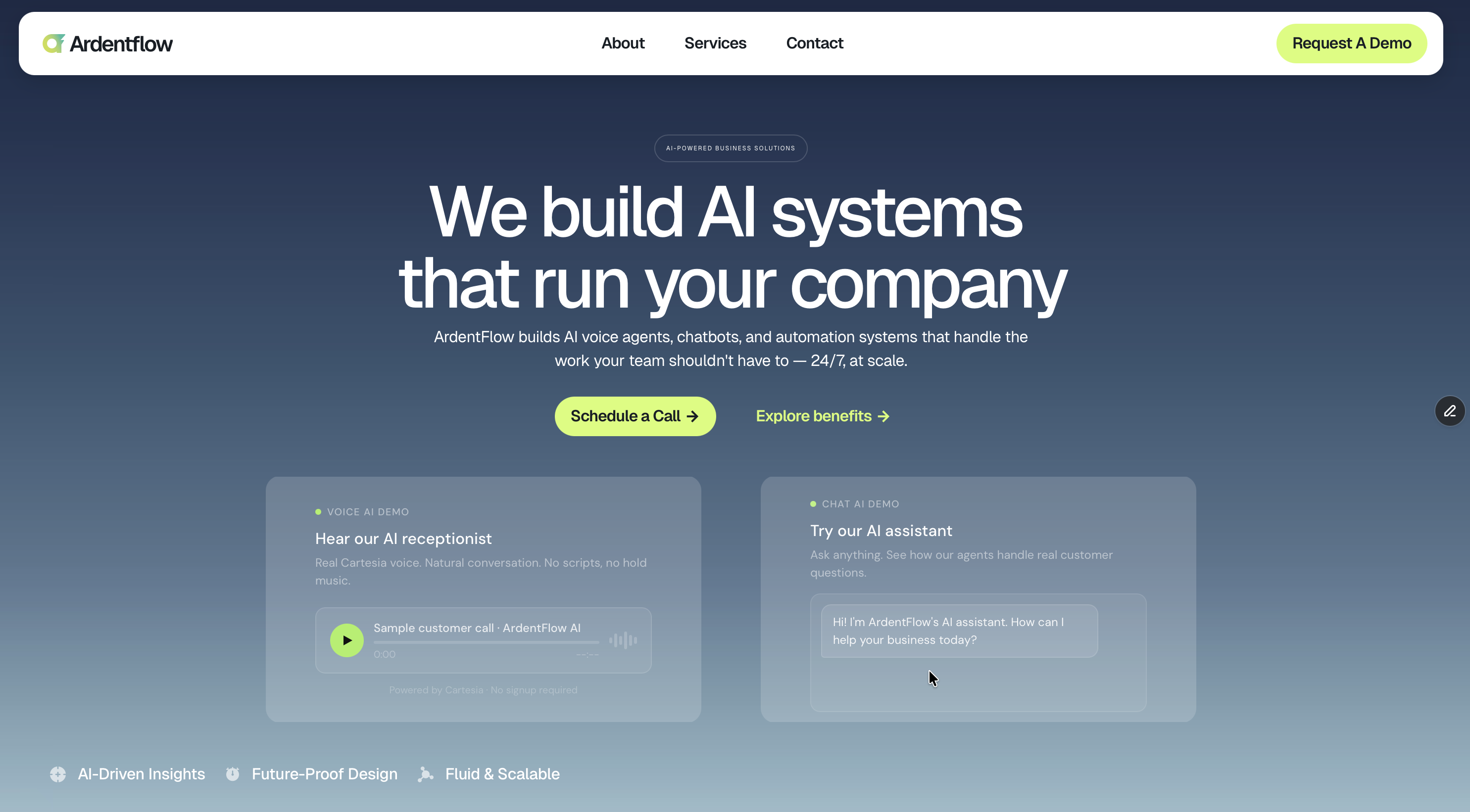

Brand Identity
The ArdentFlow.ai brand mark was built to express motion, energy, and modern technology. The symbol uses an abstract “A” for Ardent — the drive that fuels the passion for technology — while “Flow” represents the culture and motto the company stands by.
 ardentflow
The icon resembles a modern take of geometry and gradient contrast.
By introducing uncommon tones not typically seen in the AI industry, the palette creates a distinct visual identity setting ArdentFlow apart from competitors.
Icon
The ArdentFlow icon was created to capture the brand’s core idea in a single, fluid mark. Built from an abstract lowercase “a,” the symbol represents Ardent as fire, passion, and inner drive, while its forward motion expresses Flow as movement, momentum, and seamless progress. The result is a modern identity that feels energetic, intentional, and built for technology.
Concept & Inspiration
The final mark translates the brand into a clean geometric symbol that feels modern, minimal, and instantly recognizable.
The abstract “a” anchors the icon to the ardent name.
The flame-inspired shape reflects passion, energy, and forward drive. Its motion represents flow, clarity, and momentum.