The Insight Behind My Brand
A one-person brand studio built on a retro-innovative look: strict symmetry paired with roundness, held to as few moves as possible.
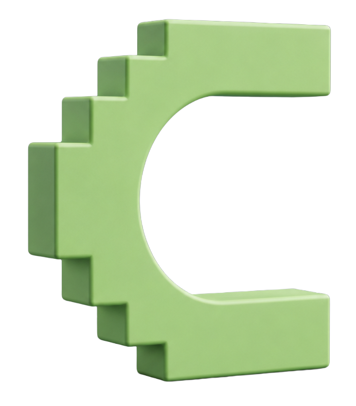
The identity is a simple expression of retro modernism — an 80s sensibility rebuilt in a modern way, drawing on the era rather than imitating it. Indigo carries the weight and lime is the only accent, with a pastel range around them: sky, lavender, baby blue, blossom and butter. The mark is a stepped C — a staircase and a magnet held in one shape.
Brand Identity
Web Development
SEO / AEO
AI Stack
THE COMPUTER THAT STARTED IT ALL
My dad brought home our first computer when I was a kid — a Tandy, this same model. The games pulled me in first, then everything else it turned out to do, and I never really got up from that chair. It was my first contact with technology and it set the pattern for everything after: every stage since has been the same instinct, get to the new thing early, find out what it can actually do, put it to work. The hardware keeps changing. The reflex has not changed since this machine.
MY BRANDING PROCESS
Purpose, vision and competitive advantage first. Then a competitor teardown — design, tone of voice, visual identity and palette — to find the space nobody occupies. Only then the adjectives, which become shape and type.
01 Purpose
02 Competitor teardown
03 Adjectives
04 Shape language
05 Symbol or wordmark
06 Typeface register
My Purpose
Turning ideas into tangible expressions that shape and form a possible reality.
Everything here started as something nobody could see yet. A brand, a site, a system — all of it begins as an idea, and the work is bringing it into the world where it can be seen, used and felt.
Expressing my creativity is my passion. It is my reason for being, and it is the purpose behind every step above.
THE WORDS
Innovative
New tools get tested on real client work, not left until someone else proves them.
Driven
The target sits higher than the brief asks for, and the work is built to reach it.
Experienced
Brand, web and marketing work shipped across very different industries.
Relentless
A constant search for value and a positive result, on every project.
Always learning
Every project adds a tool or a market that was not there before.
Perfectionist
Striving for excellence. The small details get the same attention as the big ones.
Technologist
The system behind the design gets built, not just the look.
Timeless
Work built to last ten years, not one trend cycle.
ADJECTIVES
Step 03 of the method. Before anything is drawn, the brand is named in words. Each one has to be specific enough that a designer who has never met Julio could draw something from it.
That test is why each word carries a second column. On its own an adjective is a mood. Paired against its opposite, it becomes a decision the design has to honor.
ADJECTIVE
WHAT IT PRODUCED IN THE MARK
Innovative
The stepped edge is a digital construction, not a drawn curve. Built the way software is built — in units — rather than styled to look modern.
Driven
Four rising steps on the left edge. Movement is stated by the structure climbing, not by an arrow, an italic, or a diagonal.
Experienced
Real depth and mass in the letterform. It reads as something constructed and load-bearing rather than sketched — without reaching for a crest or a serif.
Relentless
A closed, symmetrical form with no gaps and no decorative breaks. The shape holds at any size and never asks for attention to do it.
CONCEPT & INSPIRATION
Inspired by the Staircase and the Magnet
The left edge of the C is built from four rising steps. A staircase never stands still — each step assumes the next one. It reads as constant upward movement: the sky is the limit, always reaching a new height.
The overall form is a horseshoe magnet. A magnet does not attract everything; it pulls one kind of element and ignores the rest. That is the positioning — Cornavaca serves a specific niche of owners and operators who want to move forward with new technology, not a general audience.
BRAND IDENTITY
Cornavaca is built on a retro-innovative look: strict symmetry paired with roundness, held to as few moves as possible. It is a simple expression of retro modernism — an 80s sensibility rebuilt in a modern way, drawing on the era rather than imitating it.
The palette works the same way. Indigo carries the weight and lime is the only accent, with a pastel range around them — sky, lavender, baby blue, blossom and butter. Those tones give the brand its warmth and carry the 80s reference without tipping into nostalgia.
LOGO
Symmetrical and rounded, with a stepped edge — a closed form rendered with real depth.
COLORS
Indigo, lime and five pastels.
TYPE
Three faces, one job each. The wordmark is drawn once and never reset — it is artwork, not a font you type in. The other two are variable, so weight moves along an axis instead of loading a separate file for every bold and light. Inter carries the headings and BDO Grotesk carries everything you read underneath them, which keeps the pairing simple: one voice for the statement, one for the explanation.

Tw Cen MTWORDMARK
Curves and straight lines at once — the same two moves the mark is built from. Even letter sizes keep the word reading as one shape. Logotype only.
Aa Bb Cc 0123
Inter VFPRIMARY
Every heading, H1 through H6.
Aa Bb Cc 0123
BDO Grotesk VFSECONDARY
Body copy and interface labels.